
"Please feel free to share your thoughts."
Thank you for your time!
rohanpothala21@gmail.com
Improving Player Experience
Experience Designer
MY ROLE
Volunteer Project (2 months)
TIMELINE
FIGMA
TOOLS USED
As a design student, I had the opportunity to volunteer as an Experience Designer on Meowmentum, a game developed for Steam.
Why I Chose This Project
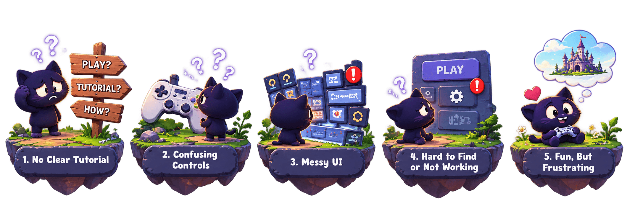
"Players are finding it hard to start and play the game because there is no clear tutorial, the controls are confusing, and the UI is messy. Important buttons and options are hard to find or don’t work well. Even though the game is fun, these issues are making the experience frustrating and need to be fixed for better gameplay"
The Problem
Problem Discovery
My first step was to talk to the client, who was a game designer at the design school. I wanted to learn about the game’s target players, what they were trying to achieve, and get a deeper understanding of the game itself.
First-person speed-running platformer
Built by a passionate team of 5
For platformer & speed-running players
Designed to reach more players
Dynamic menus & vibrant visuals
Focused on a fun player experience

Learnings from Client

Play Testing with Players
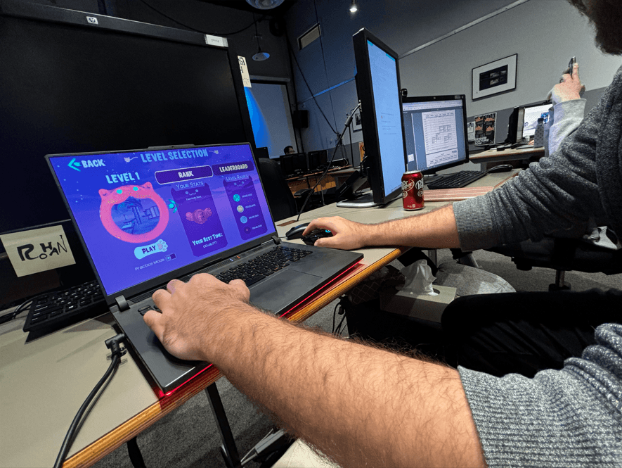
I conducted game testing with 5 players to learn about their experience.
After the playtesting, I also interviewed the players to better understand their experience and get deeper insights.

Playing the Game Myself
Before play testing and talking to players, I played through the game myself to understand the experience and note anything that felt unclear or difficult.


After playtesting and player interviews, I synthesised everything I gathered using empathy and affinity mapping. This helped me understand what players were thinking, feeling, saying, and doing, and identify common problems across their experience.

Finally, I identified the common problems across the player experience, which also validated many of my initial observations.


How Might I Solve?
From the problems I identified, I focused on the ones within my scope and started exploring how I could solve them.
How might we make the game easier to navigate?
How might we improve the UI layout and hierarchy?
How might we make interactions clearer and more consistent?
Making the menu and screens structured and with easy navigation, following the IA hierarchy
Keep game lobby clean and organized
Fixing the alignments using the grids
Positioning of buttons in the right place which is easy to access and tap
Simple and cute typography and no more than two–three fonts
Using 2–3 color tones, keeping it minimal and making sure it gives good visibility
Making scrolling visible and it works smoothly
Adding some kind of interaction for Reward Badges makes player feel engaging

Finalized solutions to work on.
Design
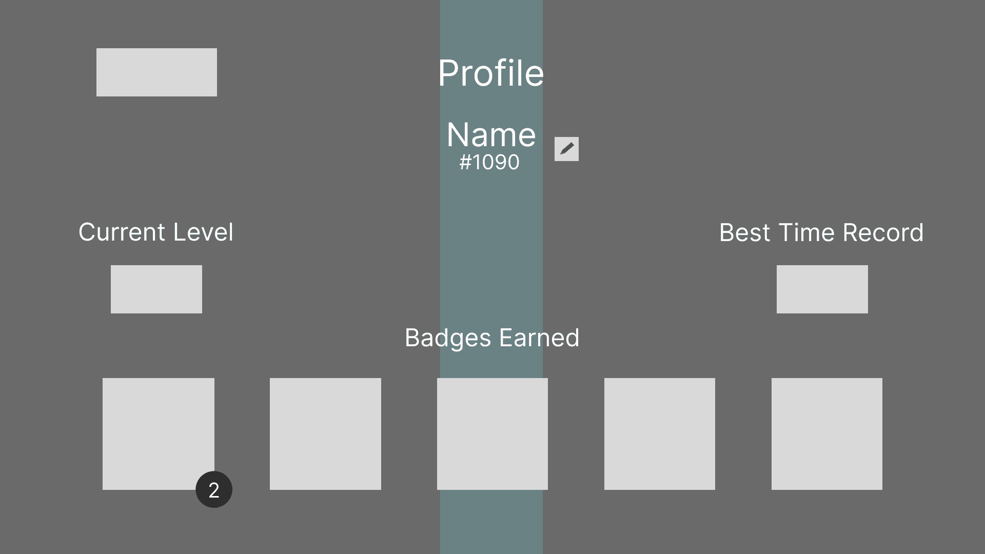
After ideating and finalizing solutions I started to work on 3 solutions, first starting with Information architecture to better the game navigation and accessability.
Now I have clear navigation across the game menu, now focusing on redesigning UI for better player experience


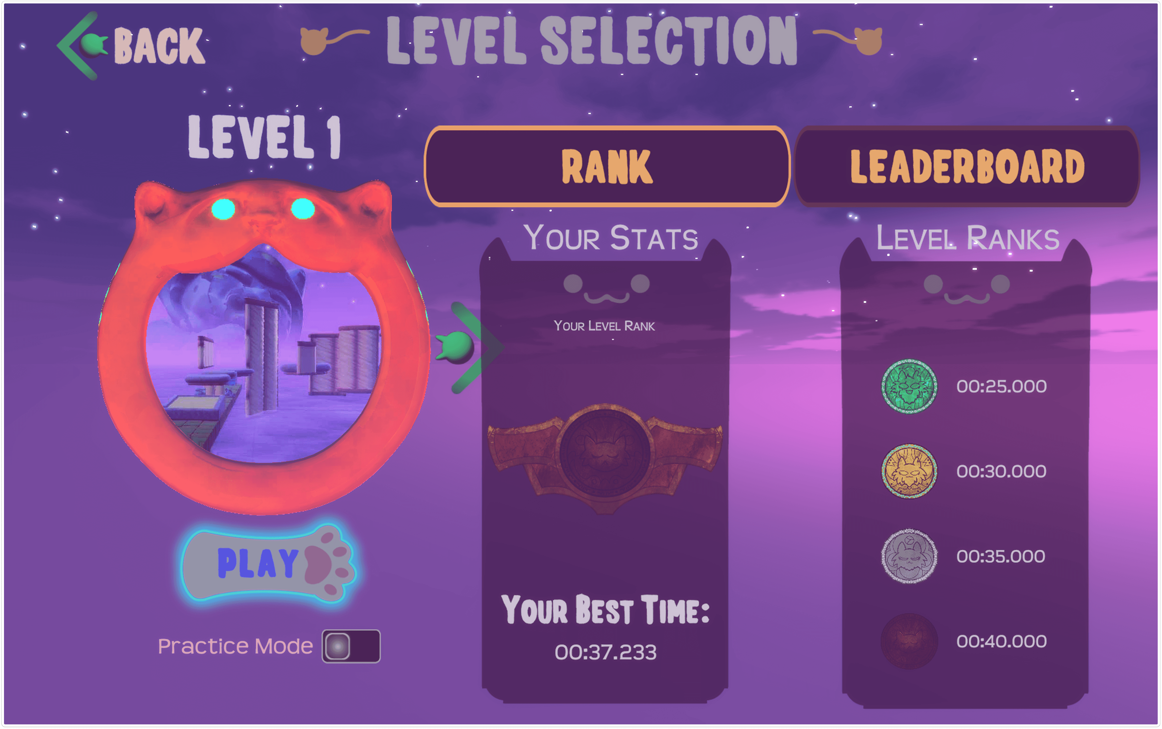
I redesigned it to improve its structure and make it easier to navigate.
Before - After
Before - After
Before - After
Before - After
Before - After
Before - After
Before - After
Before - After
Before - After




Client Feedback
"Rohan chose Meowmentum as the focus of a UX Research case study while at school and interviewed different groups of people regarding their experience with the game. He shared his findings with us regarding common pain points and drew up some wireframes for potential changes we could make. His research strongly reinforced our existing pain points and highlighted a couple of new ones, for which we are grateful :)
