





Design
To plan the app properly, I created a site map and user flows to understand the structure, user journey, and actions users would take while using the app.
With the app structure ready, I created concept sketches to plan the layout, navigation, and key elements while keeping the design simple and easy to use.
At this stage, I felt confident about the app’s look and structure. I had a clear idea of how it would be organized, visually appealing, and easy to use.
Now it was time for execution, and I was excited because this was when the idea would turn into a realistic, working prototype. I began by transforming the concept sketches into low-fidelity wireframes. This first stage of wireframing helped me set up the basic structure, placements, elements, and overall flow of the app, focusing on all the UI screens. I paid attention to alignment, padding, and how the app would look visually. This gave me a solid foundation for the app’s structure.
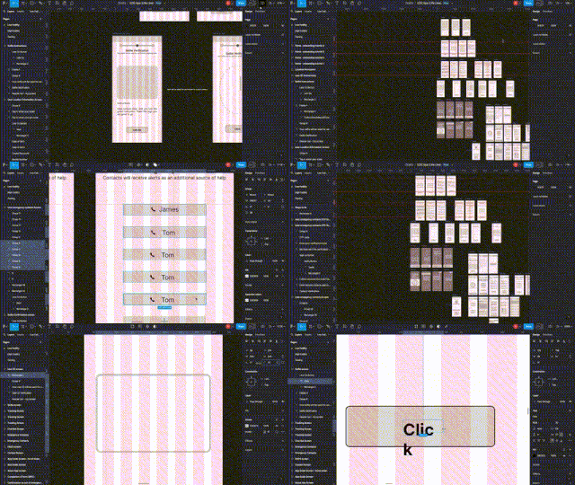
Once I was satisfied with the basic layout and structure of the wireframes, I moved on to high-fidelity wireframes. At this stage, I refined the design by adding colors, icons, typography, and imagery to give the app a polished look. I focused on usability, readability, visibility, and accessibility to ensure the design was fully user-friendly. After several rounds of changes, I felt that the design was ready to move forward with prototyping, as everything was properly aligned and cohesive.


Designing a Medical Emergency SOS App
Designing a Medical Emergency SOS App to make it easily accessible and quick to get help during a medical emergency for your loved ones.
End-to-End Product Designer
MY ROLE
Grad Project (5 months)
TIMELINE
FIGMA, Procreate, Google Forms
TOOLS USED
One morning, my uncle suddenly had trouble breathing and needed urgent help. His son, in panic, didn’t know what to do. The delay in getting the right help cost valuable time, and unfortunately, my uncle didn’t survive. No one was at fault, it was simply a matter of not having the right resources or guidance in such a critical moment.
This made me realize a serious problem: in India, medical emergencies can happen anytime, but getting immediate help is not always easy.
My Experience
During a medical emergency, people often don’t know what to do. They lack clear guidance, feel stressed, and act on instinct. Getting help takes time and dialing medical services usually involves too many questions, which slows things down. Access to support isn’t always quick or easy, leading to delays when every second counts.
The Problem


People don’t know what to do in an emergency
No Clear Steps
Too many questions before help arrives
Help Takes Time
Limited options to get support quickly
Limited Help
Access to support isn’t quick or easy
Hard to Get Help
Panic, fear, confusion
Emotional Stress






I started my research by writing down my own assumptions about what people might do in a medical emergency. I then turned those into interview questions to see if they were actually true. Then, I have conducted user Interviews with 4.
Problem Discovery
I went further and conducted a survey with 16 users to validate the findings from my user interviews.

"The survey backed up the interviews. 75% said calling for help was frustrating. 68.8% wanted help to be quicker and easier. 56.3% said getting help isn't easy."
Based on the insights gathered, I now had a clear problem to solve in helping people take fast, confident action during a medical emergency.
How might I solve?
At this stage of the project, I have a clear understanding of the core problems and what needs to be solved. To start, I did a competitive analysis to see how existing SOS services are addressing these issues and to check if there’s room for me to do better. I didn’t go into every SOS service worldwide but focused on some major ones.

I used mind mapping based on my affinity mapping themes to brainstorm ideas for each problem. I did six separate mind maps, one for each theme, to explore different ways to address these issues. Once I had all my solution ideas, I combined them into a single mind map in a mobile app structure.
Now, I have a set of clear, practical, and feasible solutions that can truly address user problems. Each step in this process helped me develop solutions that are not only useful but also realistic to implement.
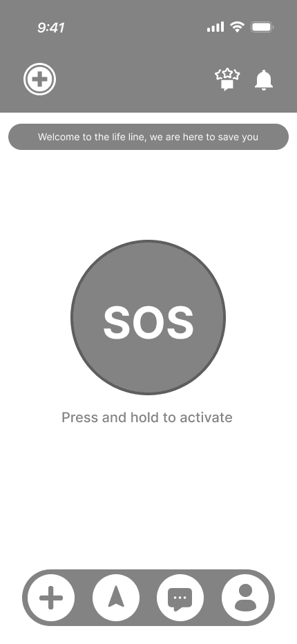
Long-press to trigger SOS. Automatically shares location, ID, and key info, alerts emergency contacts, and opens a quick medical form for responders.
Quick action button
Keeps the user informed with real-time status after SOS is triggered, without needing to open notifications.
Live activity updates
Shows the ambulance's real-time location and arrival time, reducing stress while waiting.
Ambulance live tracking
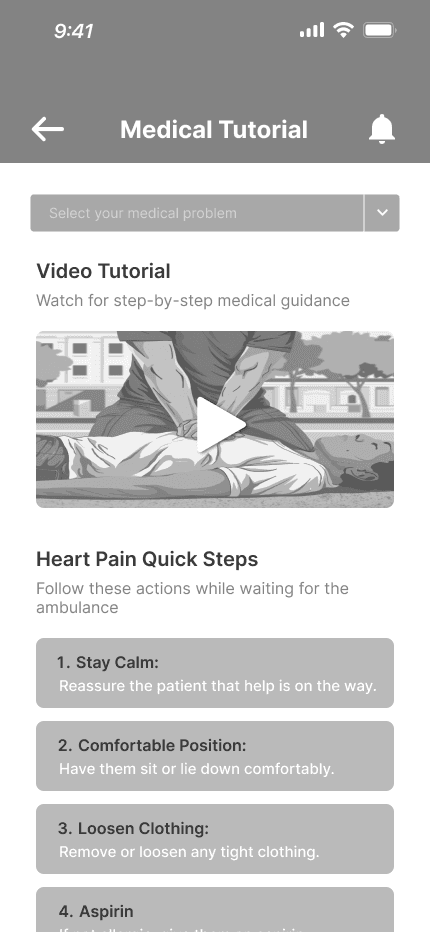
Simple, doctor-recommended steps to help stabilize the patient while help is on the way.
Medical tutorial
I created a User Journey Mapping (Future State) and a Storyboard to validate the solutions. This confirmed that the features are useful, simple, and solve the key user problems.

Brand Identity
After finalizing the solution, I focused on giving the app an identity. I named it "Life Line" because in emergencies, it could truly be someone’s lifeline. The branding is kept simple and clear to reflect trust, purpose, and reliability.

Usability Testing

At this point, I was ready to test the app prototype with real users to see how well the idea worked. I scheduled user testing sessions and, on the testing day, got users’ permission to record audio and take photos while they used the app. I started by explaining the app’s purpose and gave them a simple scenario: they would go through the onboarding, explore the app, and finally, imagine they’re in a situation where a loved one needs urgent medical help.
Since I expected users might tap the SOS button right away on the home screen, I asked them to first explore the app before testing the SOS feature. This way, they could experience the app fully and give me more valid feedback on how everything worked.
Next, I connected all the app UI screens, creating a functional flow by linking each feature to make it tappable and usable. I followed both the user flow and app flow, ensuring a structured experience with the main interaction in place. This setup allowed users to explore how the app works, and it was finally ready for testing with real users.

Focused on the SOS quick action button as the main interaction
Sketched a circular button to represent SOS clearly
Tested different sizes for better thumb reach
Checked usability within the wireframe
Confirmed the design works well for the main feature
Interaction Design
Overall felt intuitive and simple to use
SOS action was quick, no hesitation
Medical tutorial seen as genuinely helpful
Live tracking felt reassuring, reduced anxiety
SOS button didn't feel urgent or tap-safe; one user triggered it by mistake
Home screen icons had no text labels
Activity box was mistaken for a banner or slogan
Ambulance tracking wasn't visible right after SOS was triggered
Accidental triggers risk false alarms in a real emergency flow
Users hesitated identifying icons, costing time under stress
Users missed real-time status updates during an SOS
Users wanted reassurance immediately, not after several steps


Problems Identified
Iteration
I started improving the design based on the feedback I got from users, focusing on the points that made sense for the app. I received positive feedback, with just a few design changes suggested. I worked on these changes, keeping in mind what would look good and be easy to use.

It is crowded with all the nav icons
Tracking nav icon was unnecessary
Lack of clear understanding of icons
Missing text labels made icons unclear
Before
After
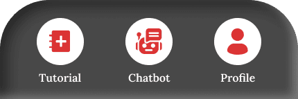
Added labels to navigation icons for better clarity
Removed unnecessary tracking icon to reduce clutter
Adjusted layout for better spacing and alignment
Refined icons for better understanding
Final nav bar is simple, clear, and user-friendly

The Emergency Alert Box is designed to display important emergency alerts and notifications while the SOS system is activated. Unlike regular notifications, it’s dedicated to critical updates, ensuring users don't have to switch screens to check alerts. While in key screens like the medical tutorial or live tracking, users can see relevant alerts and activities directly in the Emergency Alert Box, keeping them informed without disrupting their emergency process.
Emergency Alert Box


Once I had all the interaction designs ready and working on the UI screens, I started testing them myself to see how well everything was functioning. At that point, everything worked smoothly, and it felt like each interaction had a clear purpose.
Prototype
Next, I connected all the UI screens to create a working prototype. This time, I went deeper with prototyping, making the app feel real, functional, and truly usable.
At this point, my app prototype is ready for the grad project handoff. I also decided to test it with real users again to gather feedback on how well the app works and how useful it is.
Final Product - Handoff
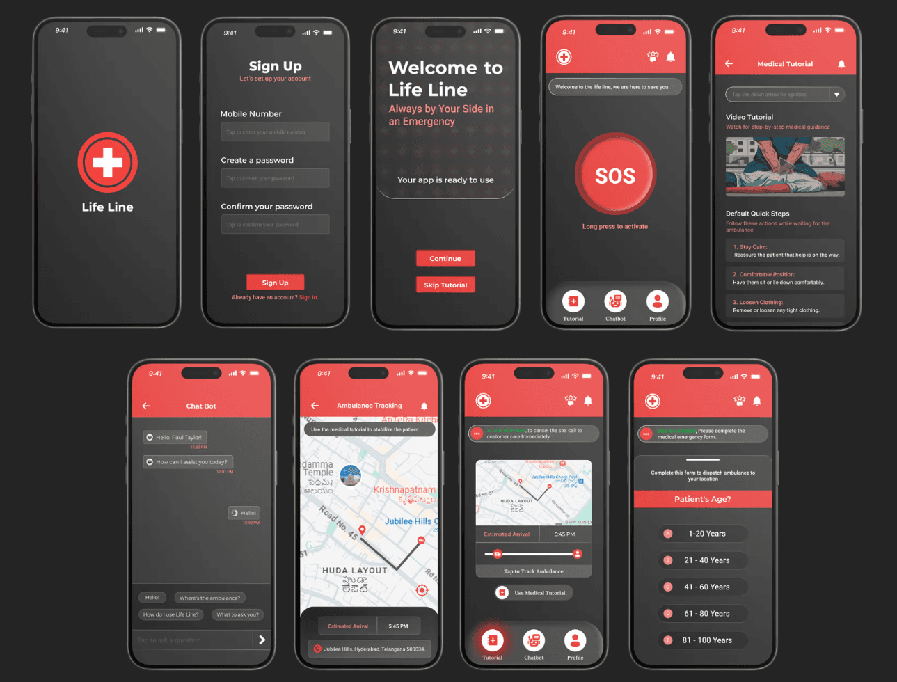
LIFELINE is a medical emergency app made to help people quickly get help for their loved ones during emergencies. By just long-pressing the SOS button, the app alerts your emergency contacts and asks four quick questions to send the right kind of help, no need to make a phone call.
It also shows live ambulance tracking with estimated time of arrival, so you feel less worried. The app gives simple medical steps and video guides to help you take care of the patient while waiting. A built-in chatbot is there to explain how everything works.
LIFELINE is designed to be easy and fast to use, even in panic situations. The main goal is to reduce stress and help users take the right steps to get emergency help as quickly as possible.
Finally, I have MVP Design with a working prototype with all the core features. Initially, the SOS app was just an idea, based on assumptions and a problem. Now, I see it as a real solution with a clear purpose. With this product's first version, I’ve reached a stage where I have an MVP ready to showcase.
My key takeaway from this project is the importance of conducting thorough research within the given timeframe to gather the right data. This helps in understanding users' experiences, pain points, and goals. Validating designs at each stage ensures I'm addressing the right problems. I also learned that iteration is essential, as there's always room to improve the user experience. Through usability testing, I gained insight into handling different types of feedback, focusing on the most relevant ones. Overall, I realized how valuable user feedback is for improving designs and how focusing on user needs leads to creating a useful product. Ultimately, I learned how to bring an idea to life.
My Key Learnings from the Project




The final step screen shows users the remaining steps to finish sign-up and begin using the app.





I made the "Add" buttons rectangular for better visibility and ease of use, ensuring consistency when contacts are added and displayed.
The goal was to keep the main screen simple and uncluttered, making the quick action button easily accessible and highlighted, encouraging users to long-press it for immediate help.
The medical emergency form is designed to quickly gather essential information and ensure the right help is dispatched. It focuses on straightforward, important questions for efficiency.
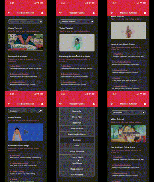
The medical tutorial guides users on stabilizing the health of their loved ones, starting with a dropdown menu to select the medical issue. It then provides a quick video for visual instructions and concise written steps for easy reading.
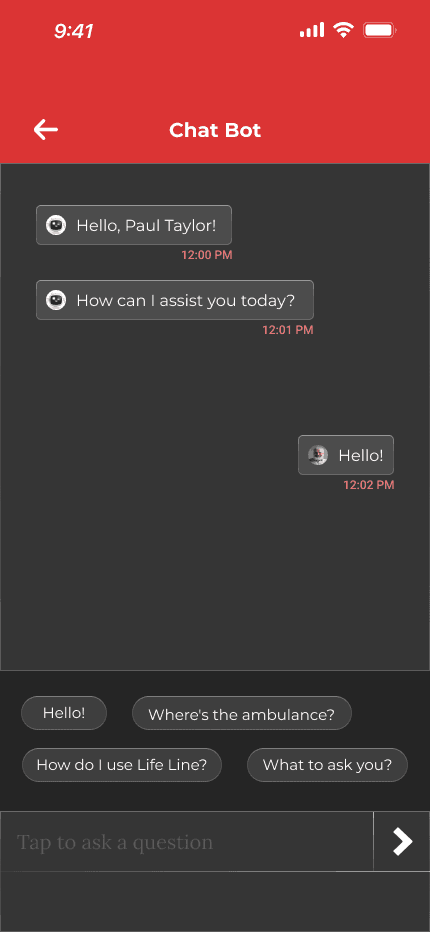
The chatbot is designed to provide a human-like connection, offering users the information they need whenever required.
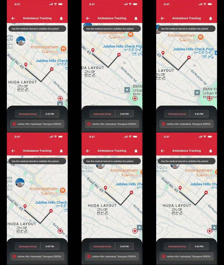
The idea behind ambulance live tracking is to keep the user informed and help control their emotions. It shows the estimated arrival time and location, reassuring the user that help is on the way.
The quick onboarding tutorial is designed to introduce users to the app’s features and elements. The goal was to keep it simple, with an option to skip the tutorial if desired.
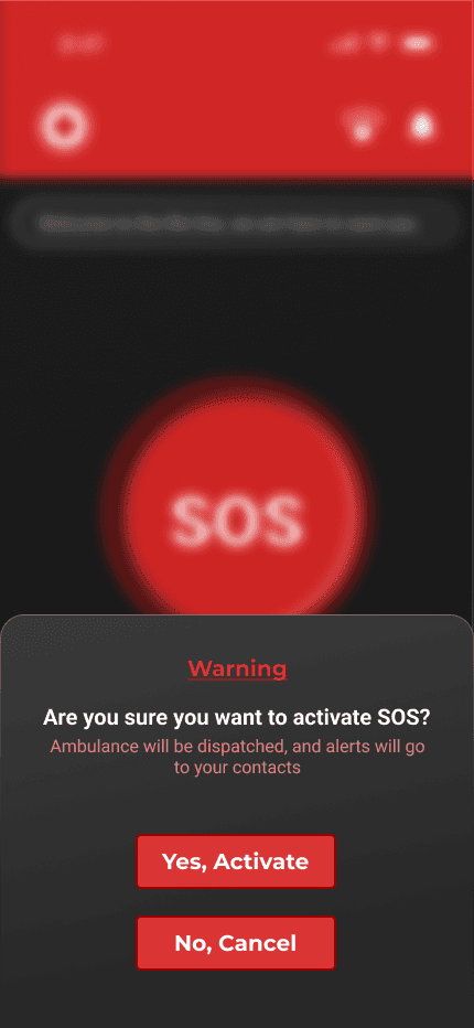
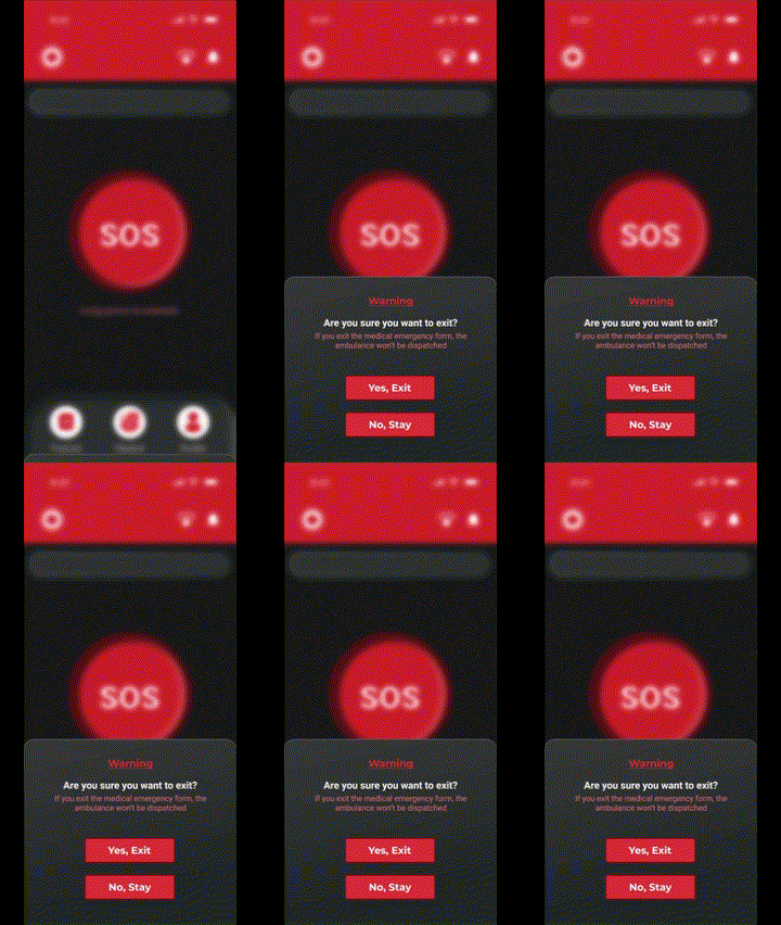
The quick action button activates the entire system to bring help. To prevent accidental activation, a warning appears when the button is long-pressed, asking the user to confirm if they’re sure about activating the SOS system.
The SOS quick action button interaction was designed to inform users when it’s being long-pressed, with a green loading border appearing around the button. The goal was to create a smooth, quick transition while clearly indicating the SOS is being activated.
Once the ambulance is dispatched, the screen shows live tracking and highlights the medical tutorial, encouraging the user to use it to stabilize the patient until help arrives.
Once I had a clear view that everything looked good with the UI screens, I moved on to designing interactions. This time, I focused on creating deeper interactions that would keep the user informed and engaged at every step, enhancing the overall experience.