This case study is currently being updated. Please check back later for the latest version.

Designing a Medical Emergency SOS App
UX/UI Design
TYPE
Graduation Final Project
ROLE
PLATFORM
TOOLS
Product Designer
IOS
FIGMA, Procreate, Google Forms, Pinterest
One morning, my uncle suddenly had trouble breathing and needed urgent help. His son, in panic, didn’t know what to do. The delay in getting the right help cost valuable time, and unfortunately, my uncle didn’t survive. No one was at fault, it was simply a matter of not having the right resources or guidance in such a critical moment.
This made me realize a serious problem: in India, medical emergencies can happen anytime, but getting immediate help is not always easy.
Based on my initial observations, I saw possible challenges:
SOS emergency systems are complicated.
There is no simple way to get help quickly.
People often don’t know what steps to take in a medical emergency.
These observations made me explore opportunities to:
Provide quick and easy access to emergency help.
Guide users with simple steps they can take immediately.
Save valuable time and ensure help reaches faster.
Why I Chose This Project


Research
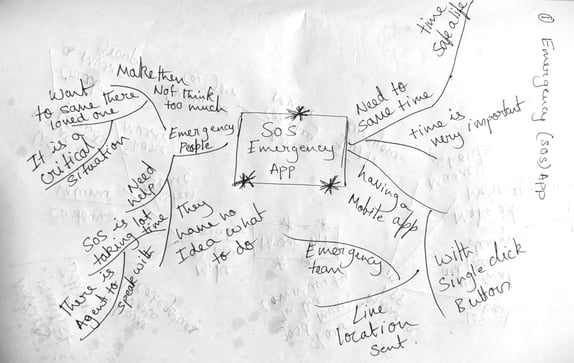
I began my research by creating a mind map to outline my initial assumptions about the challenges users face during medical emergencies. To validate these assumptions, I used both interviews and surveys.


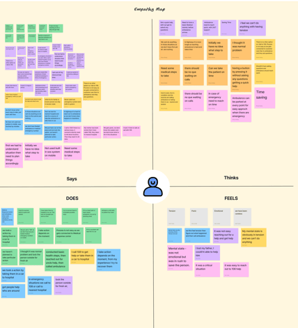
I then created an empathy map, where I looked at what users feel, think, say, and do. This helped me understand their emotions and how these feelings affect their actions when they need urgent help.



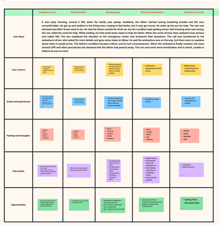
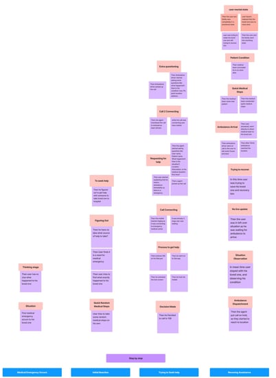
To learn more about the user experience, I created an experience map. This allowed me to see the common steps all users go through when they use current SOS services for medical help. After that, I created a user journey map to understand each person’s experience individually. This showed me any unique challenges faced by different users in emergencies.
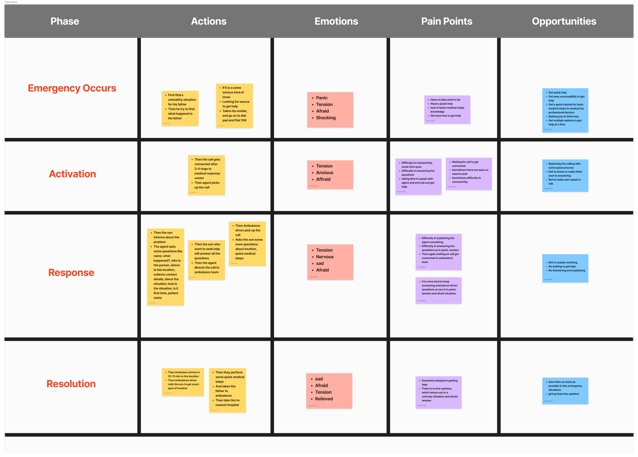


Then, I wanted to understand what users expect to happen in emergencies. I used a mental model to break down each stage of their experience, pointing out problems and finding solutions for each step. This gave me a clear view of what users want and which issues need to be solved first.
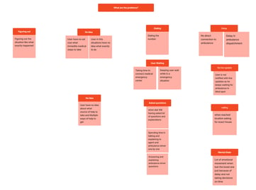
With all this information, I moved to affinity mapping, where I grouped the insights from empathy mapping into categories. This helped me spot patterns in the problems, giving me a structured view of the issues. Finally, I listed all the pain points for each category and turned them into problem statements.
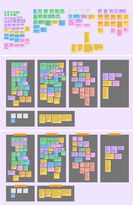

Each of these steps helped me understand the user's experience and also understand their deeper problems better. Now, I have a strong foundation to create solutions that truly address what users need during emergencies.


At this stage of the project, I have a clear understanding of the core problems and what needs to be solved. To start, I did a competitive analysis to see how existing SOS services are addressing these issues and to check if there’s room for me to do better. I didn’t go into every SOS service worldwide but focused on some major ones.
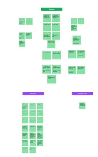
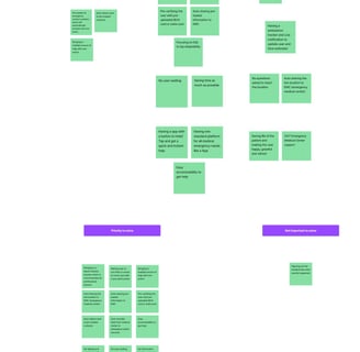
Next, I worked on finding solutions. I used mind mapping based on my affinity mapping themes to brainstorm ideas for each problem. I did six separate mind maps, one for each theme, to explore different ways to address these issues. Once I had all my solution ideas, I combined them into a single mind map in a mobile app structure. I marked the essential features at the center and placed less important but practical ideas around the edges.
Now, I have a set of clear, practical, and feasible solutions that can truly address user problems. Each step in this process helped me develop solutions that are not only useful but also realistic to implement.


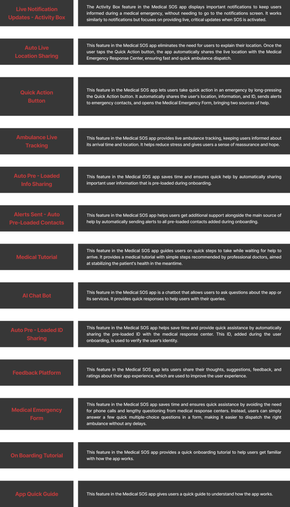
Now, I focused on organizing all the solutions clearly in terms of app features, arranging them in order with a detailed description of how each feature would work. At this point, I had a solid list of features for the app, but I also wanted to brainstorm how these features would look visually. I used Pinterest for inspiration, which helped me gather ideas on the design of some of these features, though I found only a few examples that matched my needs.

Problem Statement
Mind Mapping Based on my Assumptions
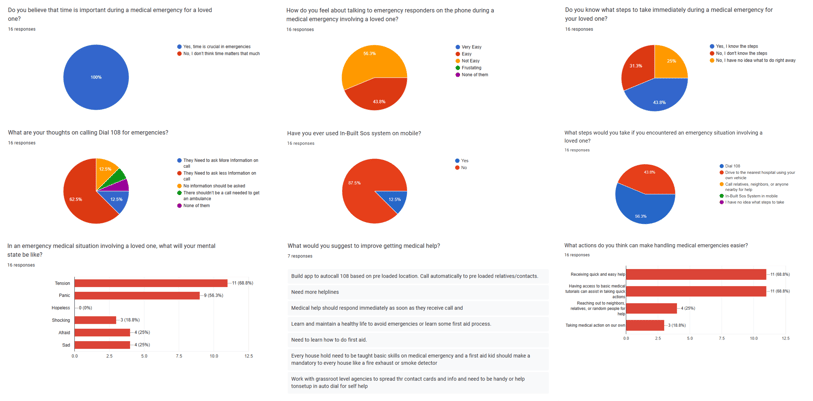
I conducted 4 user interviews and 16 surveys to validate my assumptions about medical emergencies. The interviews targeted individuals who had been involved in a medical emergency, while the surveys helped further validate these findings. The goal of this research was to understand the real challenges, emotions, and pain points users face during medical emergencies.
User Interview Findings
Experience Seeking Help
Mental State
Actions Taken
Time Taken to Get Help
Use of SOS Systems
Suggestions from Users
3 users Dialed 108, but the process was complicated and time-consuming.
1 user drove directly to the hospital.
All users felt anxious, tense, and unsure of what to do in the situation.
Most users Dialed 108, provided first aid, asked family for help, or drove to the hospital.
The process took 10-20 minutes to receive help, either through an ambulance or by reaching the hospital by car. Speaking to a 108 agent and answering questions took 2-5 minutes to get help.
All users were only aware of Dial 108 for emergencies.
Users want a faster way to get medical help without answering questions. They also suggested having clear first-aid guidance and a simple, direct way to request emergency assistance.
Survey Findings
Through user interviews and surveys, I confirmed that my initial assumptions were True.
Lack of awareness: Most interviewees were unsure of the right steps to take during a medical emergency.
Difficulty in seeking help: The process of getting medical assistance was not straightforward and often delayed.
Survey validation: While survey participants hadn’t personally faced emergencies, they shared how they would respond in such situations. Their concerns and challenges closely matched those of interviewees who had real-life experiences.
To take my research further, my next step was to gain a deeper understanding of the problem. I began analyzing user behaviors, mapping their journey, and identifying deeper challenges to uncover the root causes of the issues they faced.
Problem Finding
I created a single archetype by incorporating key findings from my research. This helped define a user personality with clear pain points and goals, allowing me to better understand and empathize with the user.
Next, I used the "Jobs to be Done" approach, which helped me understand what users aim to achieve in medical emergencies.
Key Takeaways from Empathy Mapping
Getting medical help wasn’t easy, people felt lost and unsure of what to do.
Panic and stress made it harder to make quick decisions.
Calling 108 took time (2-5 minutes to connect and answer questions).
Many didn’t know basic first aid and just did whatever felt right in the moment.
In emergencies, people either waited for an ambulance or rushed to the hospital themselves.
I created a user journey map to understand each person’s experience individually. This showed me any unique challenges faced by different users in emergencies.
Problem Solving
Key Takeaways from Competitive Analysis
Most SOS services rely on making a call to get help.
One service uses a physical device with a quick action button, but it’s impractical as users might not always carry it.
Many phones have built-in SOS features, but most people are unaware of them, and they’re rarely used.
This highlights an opportunity to create a more accessible and easy-to-use SOS system.
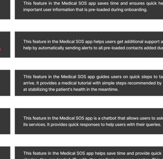
All the features of this SOS app are designed with the user in mind, based on my user research and the problems identified. The feature solutions focus on making it easy and quick for users to access medical help, with additional sources of support. The app completely eliminates the need to make a call to get help during a medical emergency. The three core features, the Quick Action Button, Medical Tutorial, and Live Ambulance Tracking, ensure that users receive timely help for their loved ones during a medical emergency.
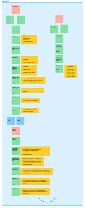
Next, I created a user journey chart to map out the step-by-step process of how users would navigate these features in the app. Then, I developed a user journey map for a future scenario, imagining how a user would interact with the app during onboarding and in a medical emergency. This helped me analyze whether the features truly solved user problems and how they compared to existing SOS services. Through this mapping, I could see that each feature served a purpose and was making a real difference in addressing user needs.


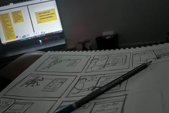
For further validation, I sketched a storyboard to visualize the user experience, especially during a medical emergency for a loved one. This visual approach provided deeper insights into how users would start using the app and their experience in an emergency. These exercises reassured me that the features I designed were purposeful, practical, and aligned with solving real user problems. Each step helped me confirm that I was on the right track with my solutions and validated that they were effective and achievable.


User Journey Mapping ( Future State )
User Journey Chart
I had a clear solution for the app and now needed to create its personality through branding. I brainstormed ideas for the logo, colors, typography, and app name. The app is called "Life Line," because in emergencies, every second counts, and it could be the "life line" that saves someone’s life.
I wanted the brand to feel trustworthy, hopeful, and reliable. Instead of using many colors, I chose simple red and white to show urgency and reliability. For fonts, I picked clean, easy-to-read styles to make the app more usable.
Though I didn’t dive too deep into branding, the simple design reflects the app’s purpose and values, making it feel dependable and trustworthy, just like the mission of "Life Line."


Brand Identity
Now that I had a clear identity for my app, I wanted to build a structure so I could move forward with prototyping. I started with information architecture by sketching the app's structure roughly on a whiteboard. I arranged all the features in a way that would make navigation simple and kept a clear hierarchy in mind. This quick sketching session, along with a basic site map, gave me a first look at how the app might take shape.
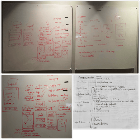

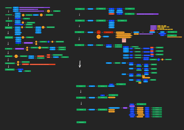
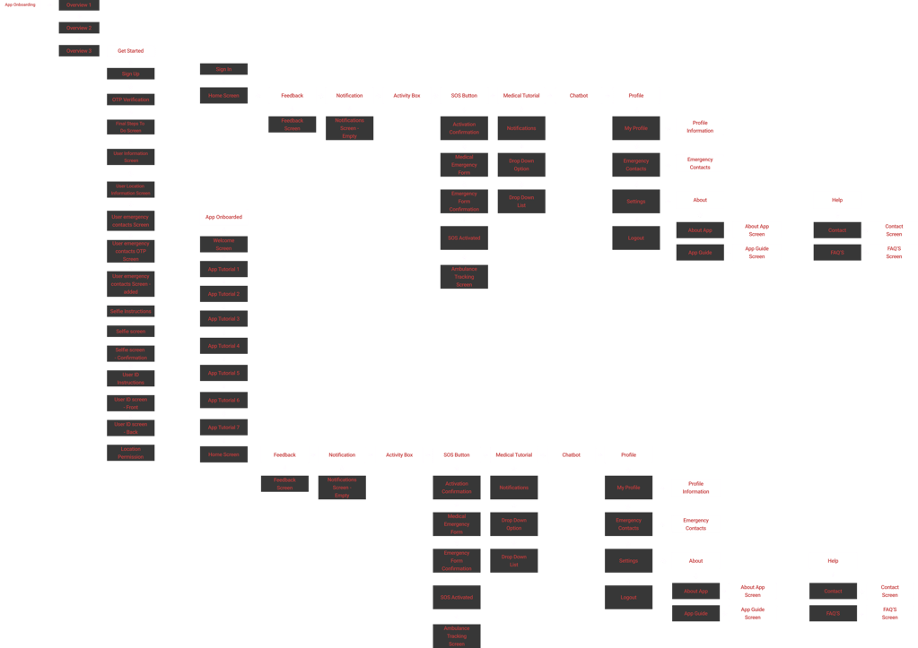
Using these sketches as a reference, I created a detailed user flow, breaking down each step to see how users would go through the app. This helped me understand the user’s journey, including the different steps they might take. I then made a clear site map to set up the app’s structure, making sure it would be easy for users to navigate and understand. Although I made some adjustments later in the design phase to improve user-friendliness, this user flow and site map provided a strong foundation.


With the app clear structure, I then focused on its visual look, including navigation elements, layout, and placement of all components. I started creating concept sketches to get a feel of how the app would look, focusing on better placement, a clear hierarchy, and highlighting important features. I also kept some design principles in mind, like making the app easy for users to remember and recognize.
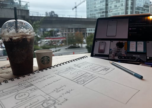

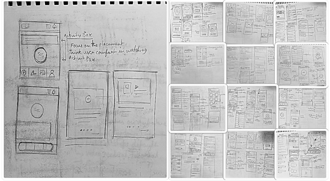

At this stage, I felt confident about the app’s look and structure. I had a clear idea of how it would be organized, visually appealing, and easy to use.
Now it was time for execution, and I was excited because this was when the idea would turn into a realistic, working prototype. I began by transforming the concept sketches into low-fidelity wireframes. This first stage of wireframing helped me set up the basic structure, placements, elements, and overall flow of the app, focusing on all the UI screens. I paid attention to alignment, padding, and how the app would look visually. This gave me a solid foundation for the app’s structure.


Once I was satisfied with the basic layout and structure of the wireframes, I moved on to high-fidelity wireframes. At this stage, I refined the design by adding colors, icons, typography, and imagery to give the app a polished look. I focused on usability, readability, visibility, and accessibility to ensure the design was fully user-friendly. After several rounds of changes, I felt that the design was ready to move forward with prototyping, as everything was properly aligned and cohesive.


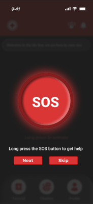
Next, I concentrated on interaction design. I focused on a single, essential interaction making the SOS quick action button on the home screen tappable. Since this button is the heart of the app, it was crucial to test how users would interact with it. To explore this, I quickly sketched a circular design, which intuitively represents an SOS button, and checked if it was easy to tap. I tested various sizes to ensure they worked comfortably for different thumb sizes and assessed the interaction within a wireframe to verify usability. This initial testing helped me understand how well the design worked for this key feature.
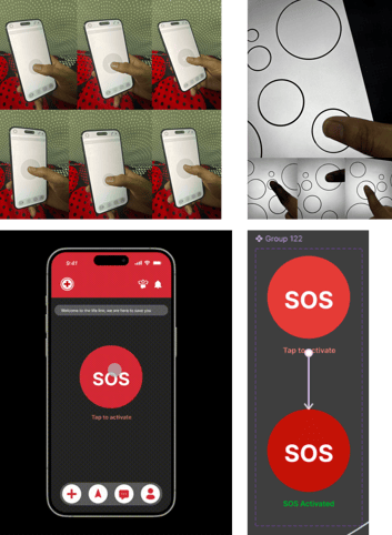

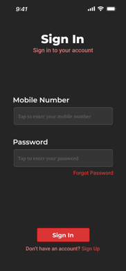
Next, I connected all the app UI screens, creating a functional flow by linking each feature to make it tappable and usable. I followed both the user flow and app flow, ensuring a structured experience with the main interaction in place. This setup allowed users to explore how the app works, and it was finally ready for testing with real users.
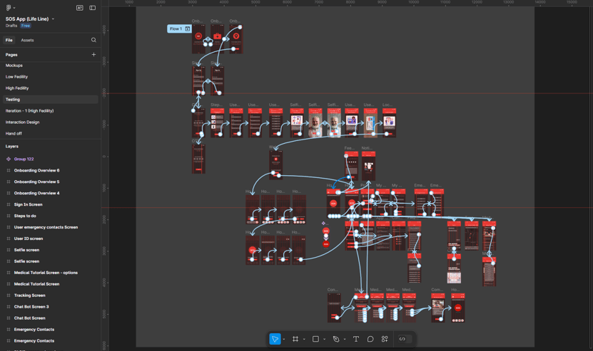

User Flow
Site Map
Concept Sketches


Low Fidelity Wireframes


High Fidelity Wireframes
Prototype
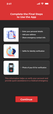
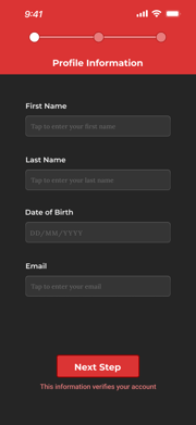
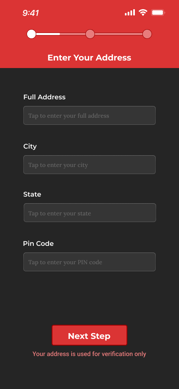
At this point, I was ready to test the app prototype with real users to see how well the idea worked. I scheduled user testing sessions and, on the testing day, got users’ permission to record audio and take photos while they used the app. I started by explaining the app’s purpose and gave them a simple scenario: they would go through the onboarding, explore the app, and finally, imagine they’re in a situation where a loved one needs urgent medical help.
Since I expected users might tap the SOS button right away on the home screen, I asked them to first explore the app before testing the SOS feature. This way, they could experience the app fully and give me more valid feedback on how everything worked.
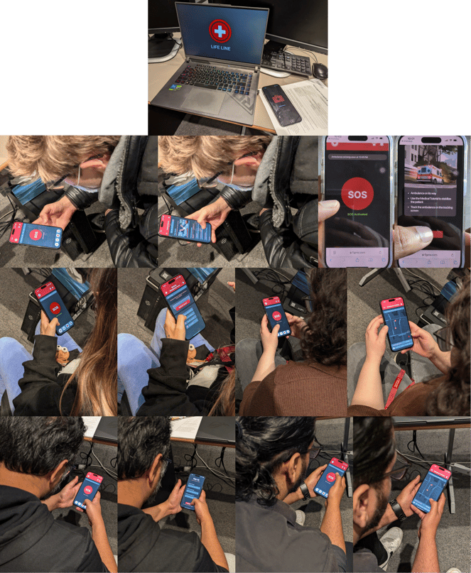

After user testing, I asked participants some quick interview questions to get their feedback and understand their experience. I recorded these interviews and later listened to them, taking notes to help me analyze the responses.
To find common issues, I grouped similar feedback into patterns. Then, I did an affinity mapping exercise, where I organized all the feedback into categories and gave each category a name. This helped me see the overall view.
Finally, I went through all the problems from the affinity mapping and picked the ones that made the most sense for the app. Since the feedback was mixed, I chose the points that were practical and added value to the app, without being biased by any one opinion.
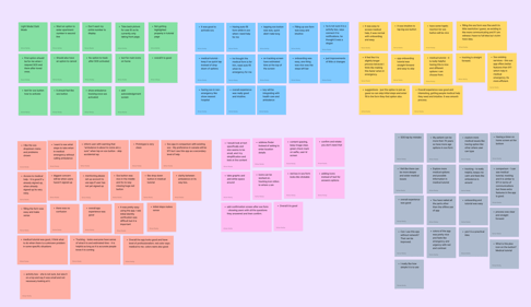

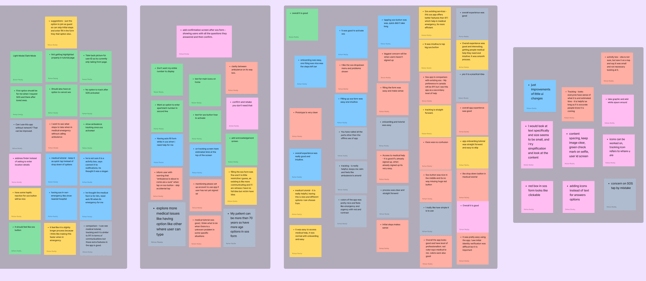

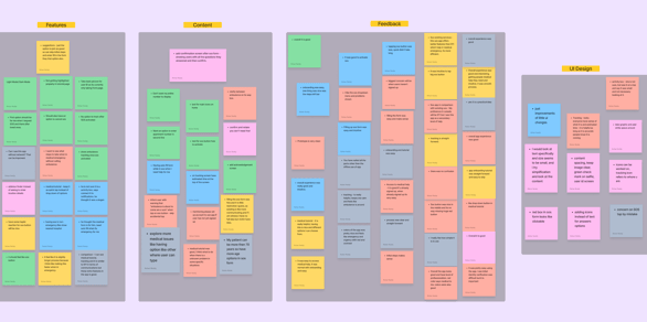

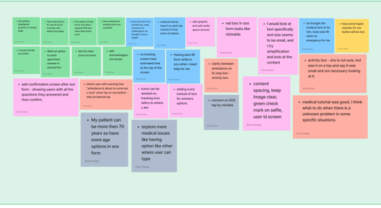


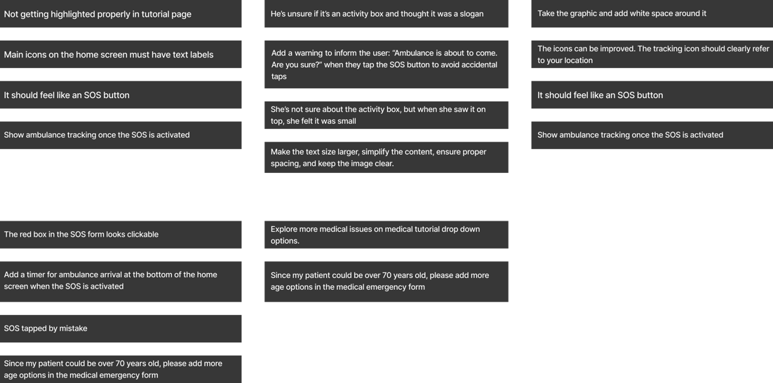

I started improving the design based on the feedback I got from users, focusing on the points that made sense for the app. I received positive feedback, with just a few design changes suggested. I worked on these changes, keeping in mind what would look good and be easy to use.
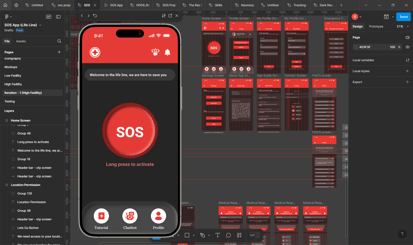

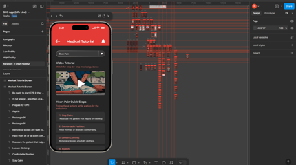

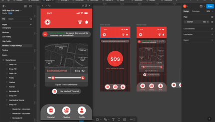






















Key Feedback from Usability Testing
Positive Feedback from Usability Testing
Usability Testing with Users
Affinity Mapping
Usability Testing
I designed this with a focus on visuals and appearance. From my experience, most app bottom navigation bars look similar, so I decided to try something different. This new design felt simple and looked good visually.


Before


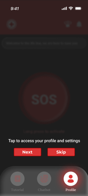
I redesigned the bottom navigation bar based on user feedback. Users suggested adding labels to the icons to make them clearer, so I added names to each one. However, the design felt crowded with the labels, especially since one icon (for navigation) was only useful when the SOS feature was activated. I decided to remove this icon, which made the layout less crowded.
When I added labels, I realized the nav bar needed to be taller, but the circular icons didn’t align well with the curved corners. So, I redesigned it with curved top corners and added shadows for a cleaner look. With only three labeled icons, the design became simpler and easier to read.
I also refined the icons to make them more relatable and easier to understand based on user testing. Overall, this change made the app more user-friendly.
After
Iteration Based on Users Feedback
Once I had a clear view that everything looked good with the UI screens, I moved on to designing interactions. This time, I focused on creating deeper interactions that would keep the user informed and engaged at every step, enhancing the overall experience.


Once I had all the interaction designs ready and working on the UI screens, I started testing them myself to see how well everything was functioning. At that point, everything worked smoothly, and it felt like each interaction had a clear purpose.
Next, I connected all the UI screens to create a working prototype. This time, I went deeper with prototyping, making the app feel real, functional, and truly usable.


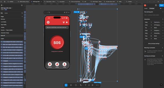


At this point, my app prototype is ready for the grad project handoff. I also decided to test it with real users again to gather feedback on how well the app works and how useful it is.


Final Product ( Solution )
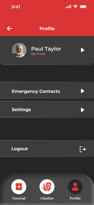
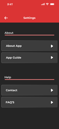
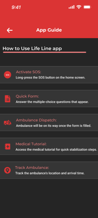
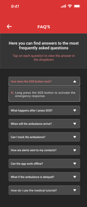
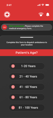
LIFELINE is a medical emergency SOS app designed to help people provide immediate assistance to their loved ones during a medical emergency. The app is just one step away from offering multisource medical help. By long-pressing the SOS quick action button on the home screen, it alerts emergency contacts and prompts users to fill out a medical emergency form with four quick MCQs to send the right help. This removes the need for calling emergency services and explaining the situation.
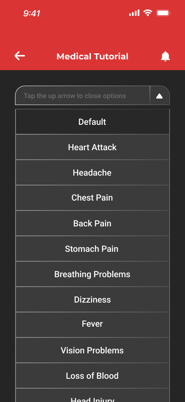
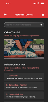
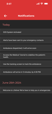
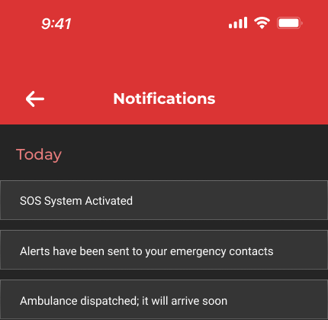
The app also features live ambulance tracking with an estimated arrival time, designed to reduce user anxiety and keep them informed. It provides medical tutorials with quick steps and video guides for different medical issues, helping users stabilize the patient’s condition while waiting for the ambulance. These features are meant to keep users calm, guide them through necessary steps without stress, and ensure quick help.
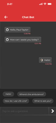
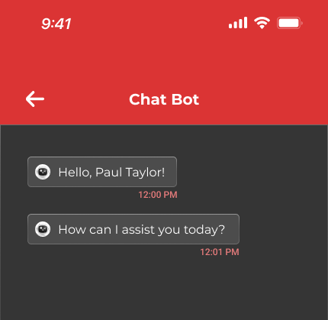
Additionally, the app includes a chatbot to help users learn more about its features and services. LIFELINE is designed to be easily accessible, as most people carry their mobile phones with them at all times.
My initial goal for this project was to provide users with quick access to medical help, guide them on important medical steps, save time, and make the process as quick and simple as possible.


Feedback Gathered from Usability Testing
Interaction Design
Prototyping
LIFE LINE : SOS Medical Emergency App ( Final Product )
My key takeaway from this project is the importance of thorough research within the given timeframe to gather the right data. This helps in understanding the human experience, pain points, and how users think and what they are trying to achieve. Validating designs at every stage is crucial to ensure I am on the right track and addressing the correct user problems. I also learned that iteration is key there’s always room for improvement to create a more intuitive experience for users. Through usability testing, I learned how to handle different types of feedback, even when they are not common, and how to focus on the relevant feedback that benefits the project. Overall, I understood how valuable user feedback is in improving design, and how the design process, along with a focus on user needs, Helps in creating a useful product. In the end, I gained valuable knowledge on how to bring an idea to life.
My Key Learnings from this Project
"Please feel free to share your thoughts."
Thank you for your time!
rohanpothala21@gmail.com
